A marketplace that hit 75,000 users in its first month
Marketing professionals and the businesses that need them had no good way to find each other. I designed the platform that closed the gap, owning research, flows, and the full interface alongside three developers. It reached 75,000 users in month one, 70% of them paying, and the traction secured investment for the next phase.

PROBLEM
My clients weren't guessing at this one. They'd spent years in marketing and had watched the same gap from both sides. Good people stayed booked through their existing network. Businesses asked around, hoped someone knew someone, and negotiated price with no reference point for what any of it should cost.
Both sides doing a lot of work just to find each other. That's what made it worth building. Not a hunch about a market, but a problem they'd lived with long enough to know exactly what was missing.
SOLUTION
We had to know it would work before building it properly. So instead of refining something in a vacuum for weeks, I put a first design together fast and got it in front of 45 people over video calls.
It held up. Mostly. The feedback confirmed the direction but made clear the first pass needed reworking, not polish. So I went deeper: personas, flows that felt right when someone actually clicked through rather than just making sense on paper, and finished designs built around what those 45 conversations surfaced.
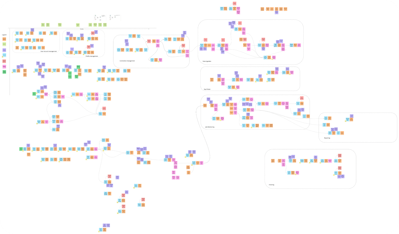
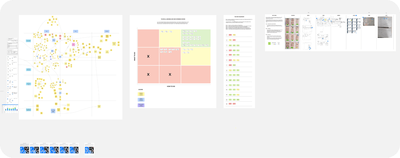
The hardest part was designing for two audiences pulling opposite ways. Businesses wanted to move fast and see options quickly. Professionals wanted room to show what made them different, not just a list of skills. Everything you add to a profile to help one side slows down the other. I favored fast browsing on the surface, with depth one click deeper, so professionals still had somewhere to make their case without turning the search into a chore.
The other call was keeping the intake form short. Tempting to ask everything up front, since more detail makes matching easier later. But every extra field is another reason someone gives up before posting anything at all. Getting people through the door mattered more than perfect data.
DELIVERY
A simple loop: post a campaign, connect with the right professional, then work together through to completion without leaving the platform. Chat, analytics, and payments built in rather than bolted on.
IMPACT
75,000 users in the first month, then another 10,000 to 20,000 every month after. That kind of curve can mean a lot of things, so the number I trust more is this: 70% chose a paid feature. People weren't signing up out of curiosity. They were paying to get more out of it. The traction secured real investment.
How much of that is design? Some of it. My clients' industry knowledge shaped what the platform needed to do, the engineers built something stable enough to survive month one growth, and the market was ready. What design contributed was making it feel simple and trustworthy enough to use for something as high stakes as hiring and getting paid.
RETROSPECTIVE
What I'd do differently is instrument it from the start. We launched knowing the numbers would move, but without a way to see which parts of the design were doing the work. 75,000 users and 70% paid is a great headline. I still can't tell you whether the short intake form or the fast browsing did more of the lifting, and I'd like to know. Next time the tracking ships with the first version, not after.
The 45 calls also taught me something about testing early. The version I showed people was rougher than I was comfortable with, and that discomfort was the point. Polish makes people polite. Rough makes them honest.


MORE PROJECTS

Running a fast growing SaaS site solo
Three languages, a growing product line, 175+ posts, one person keeping it all coherent. I extended Pentagram's design system with everything that came after it. Active users doubled, the site never slowed anyone down.

A Fortune 500 team was bouncing between seven tools to get one piece of data. I led the design of the portal that replaced them all. Requests dropped from 12 days to 30 minutes.